Brand typography can be one of the most overlooked elements of a brand style guide. But in reality, typography is probably the most frequently used element of your brand book. So how do you find the right font set to send your message? We asked a few of our expert brand designers about their process.
The Basics of Typography
Typography can broadly be defined as the appearance and style of text in written materials – or the way that letters are brought together in materials in order to reflect a specific brand’s visual system. If you are not a graphic designer, chances are you don’t spend much time thinking about typography, but our Gigasavvy creative agency design team spends a great deal of time considering this element as an important element of brand development.
Jacky Northgrave, Art Director, sees typography as one of the most impactful elements of a brand. “Typography is truly like a science and the core of any brand. We see typography used every day, multiple times a day. It’s amazing to me that something can have incredible impact – either positive or negative – when designed correctly.”
Relevance of Typography in Shaping a Brand Image
Whether you intend it or not, your visual look and feel is communicating something about who you are, and the way you do business. Each of the visual elements of your brand identity represent the innate perceptions of your brand. Where color evokes emotion, typography conveys personality – for example some typefaces can be distinctly interpreted as classic, modern, formal or casual. Mixing multiple typefaces to create a distinct typography style allow brands to show a multi-faceted brand personality.
“In a brand refresh, typography is one of the key components to revise. It has this amazing power to change the look and feel of any brand and elevate with a simple font change,” says Jacky.
Nicole Pawlowski, Sr. Art Director, sees typography as a central element to brand identity. “All the visual elements of a brand need to work together to communicate a complete story.”
Matching Typography to Personality
Gigasavvy Senior Designer and branding specialist, Ryan Schram, carefully considers the brand’s personality before choosing a typography direction: “Obviously, brand feel and flavor is going to dictate which direction to go when making final brand font or font set choices. There are times when I know that a big bold sans serif is the way to go for a particular project. Other times, I may need to see a variety of font styles together to begin to narrow things down.”
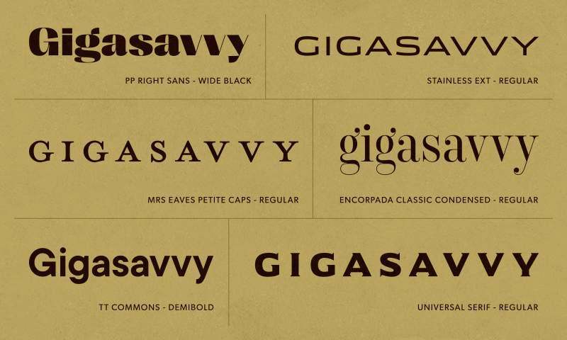
“Either way,” continues Ryan, “I like to collect a handful of typefaces and construct the same work mark in the many different fonts. Seeing everything on a page together is the quickest way for me to really narrow in on a final brand font; this is especially true for logotypes.”
“I also think there are occasions when it’s cool to get funky with a brand font if the project calls for it. Hoodzpah has been building a portfolio of unique typefaces over the past handful of years and they’re delightful. House Industries has been in the business of soulful fonts for a few decades now. Their library is fantastic as well.”
But at the end of the day, it takes some creative play to match the right font to your brand. “I don’t think there are too many hard and fast rules here,” says Ryan. “I mean, of course make sure it’s legible. It’s all about getting several fonts down on a page, seeing them in action, and really feeling out what is working.”
Typeface vs. Font vs. Typography
Many people use all of these words interchangeably, but they each carry different meanings. Typeface refers to the design of the lettering — for example, the weight of vertical vs horizontal lines, the angle of the slope, the height vs width and serif vs sans serif. Fonts are iterations on a typeface to display letters in different formats such as bold, italics, upper and lower case. Typography then also adds additional elements in how these characters are displayed together, such as letter spacing and the spacing between lines.
How to Find the Right Typography
Because so much of our world is digital, Google typefaces have become a standard go-to. These fonts are free, and can be used for any digital application. But when you have creative freedom, there are resources that only the pros can tell you about.
“When it comes to choosing typography for a brand I often head straight to reputable font foundries,” says Ryan. “Lately, this has included TypeType, Pangram Pangram, and Monotype. I’m a sucker for the classics and I often reference the Meggs and Carter quintessential Typographic Specimens: The Great Typefaces. This simple collection of fantastic typefaces has served me very well over the years. I enjoy comparing fonts that are featured in the book to any fonts I’m considering using to carry a brand. These fonts are considered great typefaces for a reason and several of them are the foundation for many of the most prominent logotypes out in the wild today.”
When Only Custom Will Cut It
When a brand is looking for something especially unique and ownable, a custom typeface can be a great option. Specialized, professional type designers create truly fantastic options that fit the unique characteristics of your brand.
Ryan’s take: “My personal favorite type designer and letterer working today is Simon Walker. Simon has done the great Modern Times Beer word mark as well as the recent lovely Magnolia Bakery mark, among many other wonderfully sophisticated projects. Some other favorite type designers and letterers: Ken Barber (of House Industries), Neil Secratario, Jessica Hische.”
A Real-World Example
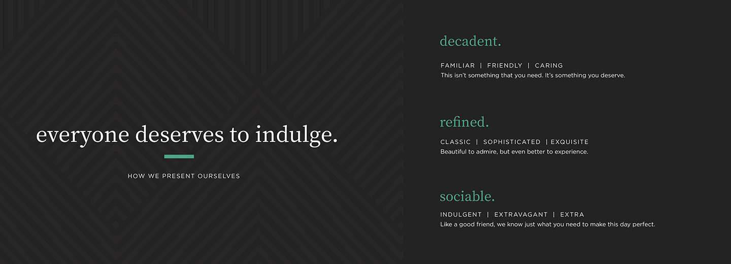
Gigasavvy brand strategy client, Brandini Toffee, was looking for a fresh, modernized take on their small-batch, handcrafted toffee brand. According to Nicole: “The entire brand is inspired by old-Hollywood glamour, inspired by Brandini’s flagship location. The typography was chosen to balance the retro vibe with a polished, modern look.”
A Few Notes and Considerations for Selecting Brand Typography:
- For any font, look for a family that includes a handful of weights and/or proportions. In many cases, you’ll want to vary the look of characters to emphasize particular word sets. Weights (light, regular, bold, black, etc.) and proportions (compressed, condensed, wide, etc.) can offer flexibility and help establish hierarchy for any given page with type.
- If you’re planning to use a script for a brand font, consider a family that includes alternates/contextual alternates and a good grip of swashes; this will allow for more customization of type. There are some scripts out there with such a range of swashes and alternates that you can make a word mark look completely personalized.
- There are some nice font pairing tools that help suggest a pair of typefaces to use together when defining your brand’s typography. These can help when you’re looking to utilize two or more fonts together for a brand.
- Be sure you’re looking at the real-life use cases of where these fonts will live. For example, if your primary application is digital, there are special factors you’ll have to take into consideration, such as Americans with Disabilities Act (ADA) compliance.
Are You as Fascinated as We Are?
Looking to learn more about brand typography? Here are some of the best books on typography we have found:
- The Elements of Typographic Style by Robert Bringhurst
- Typographic Design: Form and Communication by Rob Carter, Sandra Maxa, Mark Sanders, Philip B. Meggs, Ben Day
- Designing Type by Karen Cheng
- House Industries Lettering Manual by Ken Barber
- In Progress by Jessica Hische
Gigasavvy is an expert brand management consulting services, content creation and creative agency. We specialize in combining strategy with creativity to develop brands that have the power to connect with customers on a more human level. Contact us to learn how we can help you create a strong brand identity with our brand identity services and bring your brand story to life.
